Appearance
Genome View
The launch page of Pantograph offers a view on all chromosome-specific pangenome graphs for the selected Project. The user can load QTL regions and BLAST hits distributed along the chromosome-specific pangenomes.
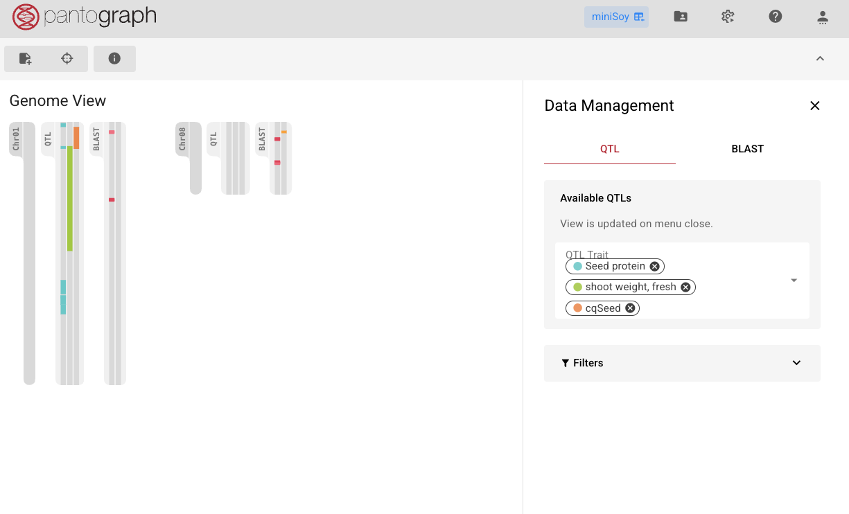
Genome Toolbar
The toolbar underneath the Pantograph logo offers these functionalities from left to right:
Legend: explains the colors of the chromosome bands, of the QTL traits and of the BLAST hits
Data Management Menu
QTL regions
In the QTL tab of the Tracks Menu, users can select traits from the dropdown menu, and the corresponding QTL regions associated with these traits are displayed along the chromosomes. Each trait is represented with a distinct color for easy differentiation.
INFO
Pantograph supports loading up to 10 traits simultaneously to maintain clarity
Pantograph supports filtering QTLs by their lengths (slider 'Filter by length') or the exclusion of QTL regions that are based on genetic maps whose coordinates possibly got translated to inaccurate genomic positions (checkbox 'Hide QTLs based on genetic markers').
Clicking on a chromosome redirects the user to the Graph View of the chromosome-specific pangenome graph, where all selected traits are loaded as QTL tracks.
Clicking on a QTL/BLAST band for a specific trait will redirect the user to the Graph View as well, but center on the clicked QTL or BLAST region.
BLAST hits
In the BLAST tab of the Tracks Menu, users can select one or more BLAST pipelines from the dropdown. Their hits are drawn as colored strips along the chromosomes.
Each selected pipeline appears as a colored chip. Click a chip to view the pipeline's alignments in the Alignment View.
- Hover a chip to highlight its hits.
- Double-click a chip to keep them highlighted.
INFO
BLAST and QTL selections share a common display limit. A "maximum selection reached" note appears when the combined number of selected traits and pipelines hits the limit.